Smashburger
01 — scope
brand refresh
website
packagaging
collateral
environmental design
merchandise
02 — goods
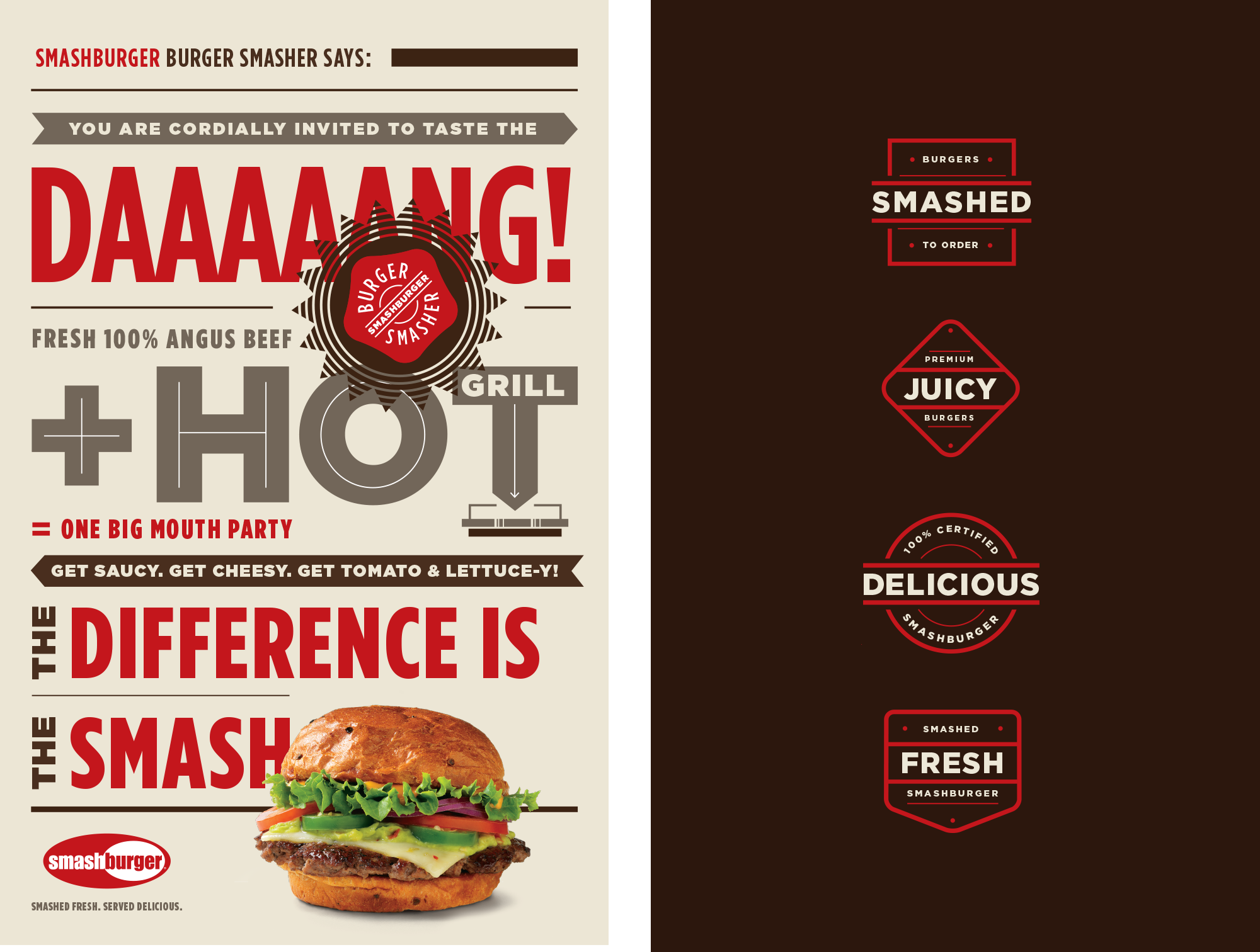
Smashburger was an early entrant into the exploding “better burger” category of fast-casual eateries. While the burgers were incredibly tasty, the brand hadn’t quite found its way yet. We helped establish an identity, a personality and an experience that matched the boldness of their food. As the name implies, the burgers at Smashburger are smashed on a hot grill. It's a technique for locking in the flavor and it was a key differentiator for the brand. To educate consumers, we created the Smashburger Burger Smasher character and let him tell the story through radio, print, social and POS.
We needed to make the quality of the experience live up to that of the burger. Everything was redesigned, in-store and out. A new brand color palette was created, new food photography and a bold voice and tone refined the customer experience at all touchpoints. We delivered a fully scalable graphics package and within 2 years they grew from 67 stores to over 200.


